‘Mad Men’ cast photo (AMC)
This week, we’re examining sexuality data from the 1960s, in celebration of the upcoming final half-season of “Mad Men” beginning Apr. 5th.
To kick off our series, let’s start by examining some basic background on 1960s population statistics. I looked at numbers from both the 1960 and 1970 Censuses to get a better idea of the decade’s growth. One caveat: the growth numbers are estimated, since the numbers I calculated would assume direct linear growth and that, in all likelihood, would not be the case due to varying factors (and the fact that population growth doesn’t happen within a vacuum).
I created some Excel tables to better show the data.
Overall Population:
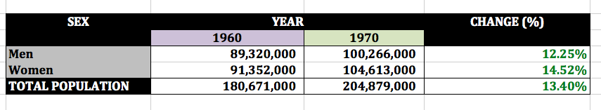
1960-1970 population data (US Census)
As you can see, men experienced a 12%+ growth over the decade, while women grew at a faster pace of 14%+, averaging out to a total population growth of 13%+.
Population Breakdown by Sex per Census:
I wanted to see how the split changed in each iteration of the Census (or if it did at all).
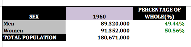
1960 population sex split (US Census)
In 1960, women just barely made up more of the population than men.
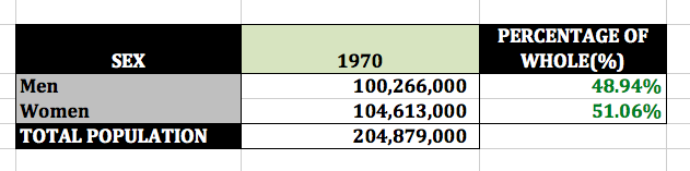
1970 population sex split (US Census)
The scales tipped further in 1970, as men lost half a percentage point of their population to the women.
Median Age at First Marriage:
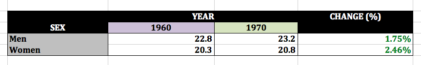
1960-1970 median age at first marriage by sex (US Census)
Throughout the decade, both men and women waited longer to get married for the first time. But even though women waited longer, they still married around age 20. (Contrast that to now, where the average age of women getting married stands at 27.)
Marital Status Breakdown by Sex:
Each of these breakdowns looks at respondents over the age of 14 (so no babies are skewing the data).
Here’s the 1960s:

1960 men’s marital status (US Census)
Married men outnumbered single men by a near 1:3 ratio.
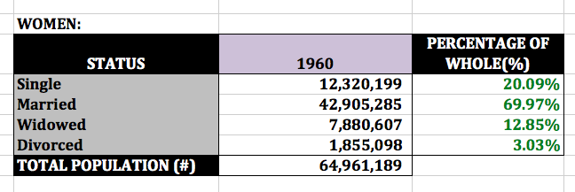
1960 women’s marital status (US Census)
Married women outnumbered single women by over a 1:3 ratio, and almost headed into 1:4 territory. There was also a much larger discrepancy between the number of widowed men and women (who reported as such, at least).
And here’s the 1970s:

1970 men’s marital status (US Census)
There are more single men, and more married men. Widowed and divorced men became virtually equal.

1970 women’s marital status (US Census)
The number of widowed women grew faster than the number of divorced women. The rate of growth between single men and single women, respectively, held steady throughout the decade.